
Colour psychology refers to the mental and emotional effects of colour. There are many proven elements to colour psychology as well as some more subjective ideas. Interestingly, cultural differences can play a part in the perception and interpretation of the effects of colour.
Surroundings can influence a person’s state of mind or emotions. If a given place is regularly found to be relaxing or irritating, there is a good chance it could be due to the colour in said place. In fact, colour psychology can easily be applied to different areas of everyday life.
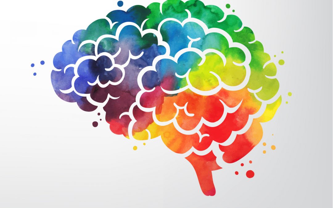
The most common psychological effects of colour can be related to two categories: cool and warm. Colours on the warm spectrum, including yellow and orange, can lead to varying emotions, ranging from comfort and warmth to anger and hostility. According to studies, some people find that looking at the colour red raises their heart rate and leads to an increase in adrenaline in the blood stream.
Warm colours are most suitable for areas designed for stimulation. They are also proven to increase the appetite which might explain why red and yellow are colours frequently used by fast-food chains. Bright colours reflect more light which can over-stimulate the eyes and increase feelings of irritation in some people. Perhaps this is why few people are drawn towards painting their kitchens or dining rooms in very bright, warm colours.
Cool colours such as purple, blue and green can invoke feelings of calmness. Blue is a calming colour and has the added effect of making a space seem larger. Decorating company Scott Anson Painters recognises the importance of colour psychology, particularly for people with specific needs such as dementia patients. In a recent project for a dementia home, the company used a soothing blue paint for patients’ bedrooms and in larger spaces.
There may be some scientific reason for the restful effect of cool colours. The colour green is focussed by the eye directly on the retina, so it causes minimal strain to the eye muscles. Blending red and blue, both warm and cool colours, purple is a balance of serenity and stimulation. Purple can be utilised to encourage creativity, with lighter shades thought to relieve tension.
The importance of colour is well known in the marketing and advertising industries. Colour is regularly used to create positive or negative associations, encourage different emotions and in many other ways. The increasing investment in this type of research suggests a growing belief in the concept of colour psychology.