
Colour blocking is a trend that can arguably be traced back to the artist Piet Mondrian, who famously created paintings using bold colours and geometric shapes. In the 1960s this was made popular in fashion during Yves Saint Laurent’s Mondrian Revolution; today, this trend has seen a resurgence and has transitioned from the fashion catwalks to the walls of our homes.
The trend involves painting solid blocks of colour in either contrasting or complementary shades. Window recesses, trims, doors and furniture all offer great canvases to experiment with.
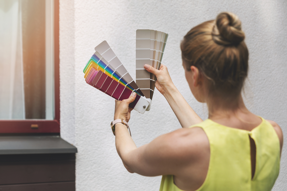
A Step-by-Step Guide to Colour Blocking
Our professional decorators at Scott Anson Painters and Decorators Ltd have given their tips on colour blocking:
The Best Areas to Paint
It is important to consider if the goal is to make a bold statement or accentuate a room’s natural features. This should offer guidance as to which areas are best to paint. Popular examples include using colour blocking to showcase a piece of furniture; to offer a blast of character to a functional space such as a dressing room; or to create a focal point in a social space like a living room.
Colour Combinations to Use
Using colour blocking is the perfect way for a person to experiment with their love of colour. Not all bold paint colours have to scream – some of the best colour blocking examples use contrasting pastel hues and soft tonal colours. For example:
Tonal Shifts: Wardrobes, doors and radiators can be given an instant uplift by painting them a bold colour that has a tonal shift to the colour of the surrounding wall and accessories.
Stimulating, Yet Soft: An office can be a great place to create a wall of geometric patterns to stimulate the mind, but consider using soft tones that offer a soothing atmosphere.
Two-Tone: By splitting a wall into two blocks of colour a room can seem more spacious. Use a darker colour on the bottom and a lighter neutral colour on the top half for the best results.