
Interior design trends can dominate decisions when decorating, but it is usually best to find inspiration from personal preferences and choose preferred colours. Favourite colours can form the base of an inspired and individual colour palette. This also ensures that lovingly painted decor doesn’t date quite so quickly when the fickle finger of fashion points towards the next trend.
Modern consumers are no longer constrained to flicking through a handful of catalogues for ideas; there are now seemingly endless opportunities for inspiration in the form of thousands of web pages and social media sites. Paint company sites and retailers often include ideas on how to incorporate colour into the home. Scott Anson Painters is a decorating company whose website includes painting advice. Sites like Pinterest can also offer a great place to file ideas while making decorating decisions.
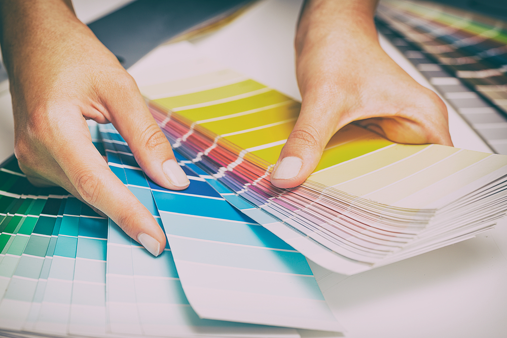
A colour wheel is a great, inexpensive tool to quickly generate colour schemes. This clever little device teaches the basics of colour theory and shows how colours might go together. Some colour wheels include information on colour relationships, which shows how different colours relate to each other. This theory is not as complex or difficult as it seems. It does not require an extensive education in colour; it just encourages planning to create a more harmonious colour scheme. For example, blue is considered a calming and relaxing colour, making it perfect for bedrooms and bathrooms, whereas yellow can improve mood and convey a feeling of energy, making it an ideal colour for kitchens.
Popular Colour Schemes
The following are popular uses of colour relationships that can form the basis of a colour scheme:
- Monochromatic colour schemes use only one colour. Varying the saturation and lightness of the colour can create stylish decor that looks professionally designed. Neutral colours are a popular choice for monochromatic schemes and work really well.
- A complementary colour scheme is the use of two colours from opposite ends of the colour wheel. This scheme will include a warm colour and cool colour to create contrast. A more vibrant effect can be created using the same saturation of the opposing colours.
Being creative when choosing paint colours and how to use them will help to create an individual style for the home. A neutral colour palette creates a soothing vibe but need not be too laid back or dull. For example, a striped wall in neutral colours offers a stylish twist to rev up a room. There are so many ways to interpret colour and create an inspired space in the home.